library(ggplot2)
ggplot(data = mpg, aes(x = displ, y = hwy)) +
  geom_point()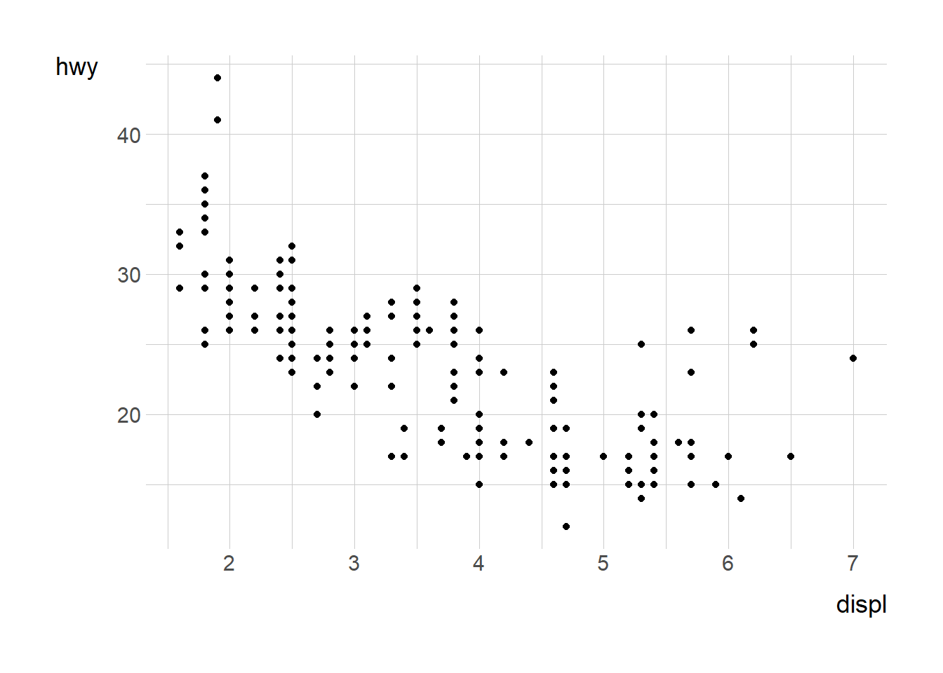
ggplot2 is a powerful and flexible R package for creating data visualizations. It follows the Grammar of Graphics approach, allowing users to layer components to build complex plots systematically.
To create a ggplot, you start with the ggplot() function, specifying a dataset and mapping aesthetics using aes().
library(ggplot2)
ggplot(data = mpg, aes(x = displ, y = hwy)) +
geom_point()
Layers such as geom_point(), geom_line(), and geom_bar() define how data is represented.
ggplot(mpg, aes(x = class)) +
  geom_bar()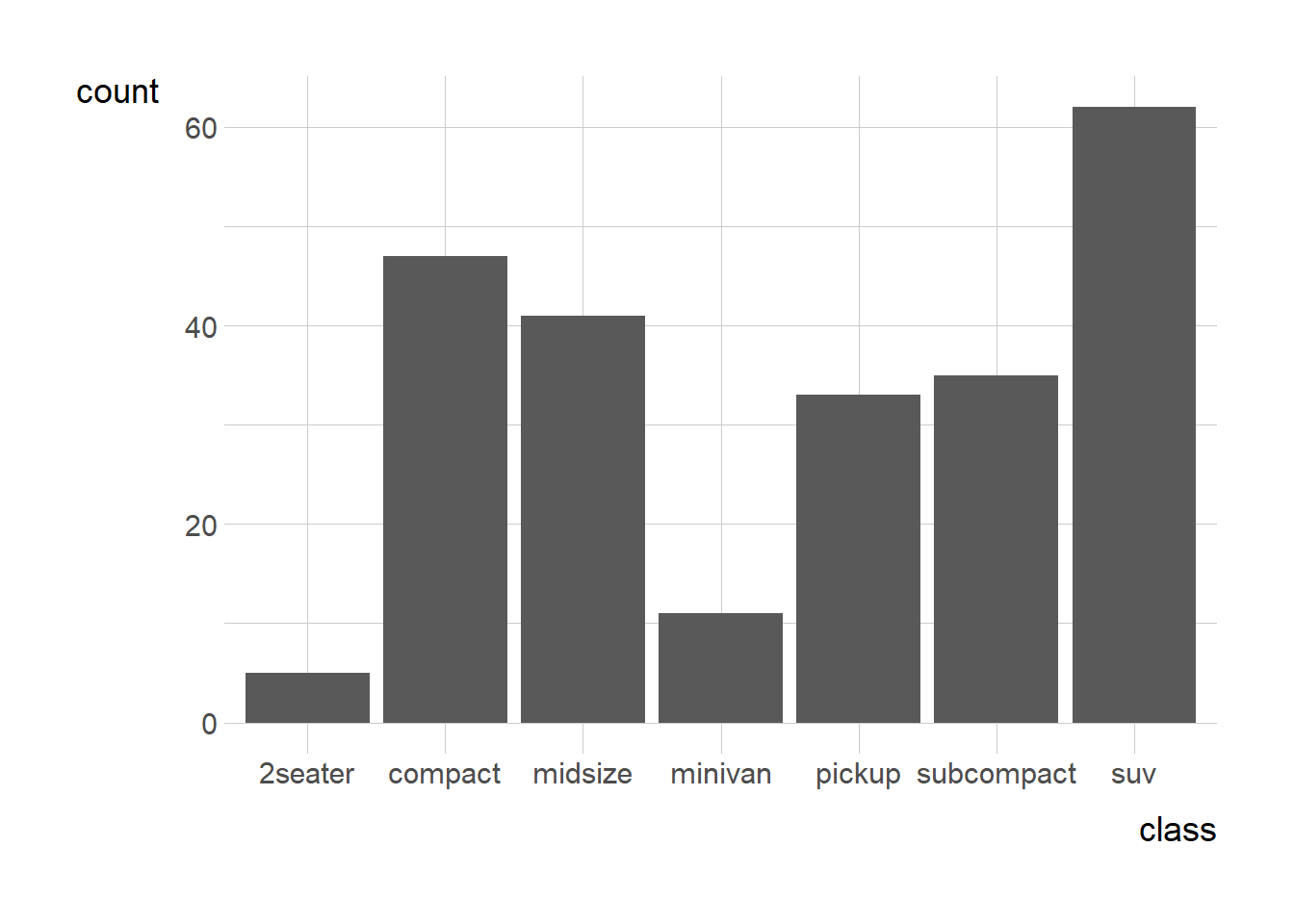
Themes, scales, and labels allow customization.
ggplot(mpg, aes(x = displ, y = hwy)) +
  geom_point(color = "blue") +
  labs(title = "Displacement vs Highway MPG", x = "Engine Displacement", y = "Highway MPG") +
  theme_minimal()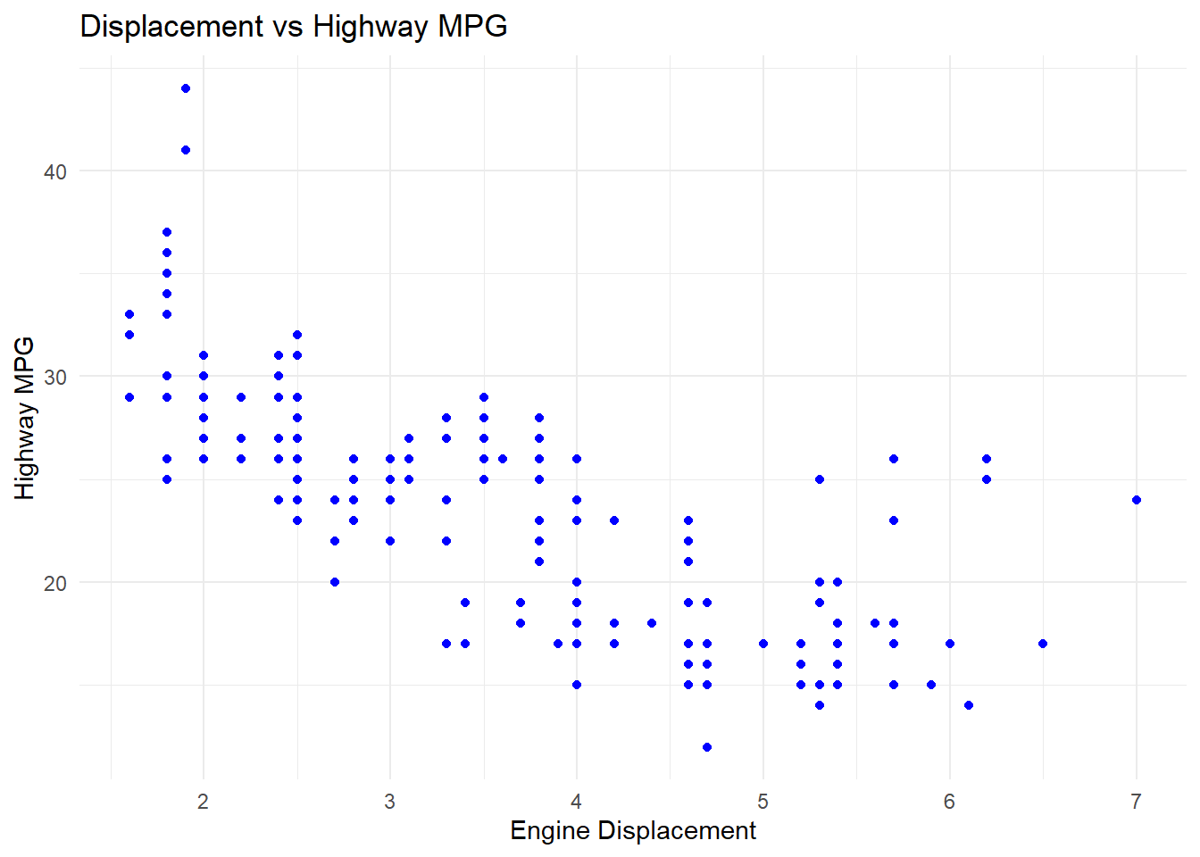
Faceting creates small multiples based on categorical variables.
ggplot(mpg, aes(x = displ, y = hwy)) +
  geom_point() +
  facet_wrap(~ class)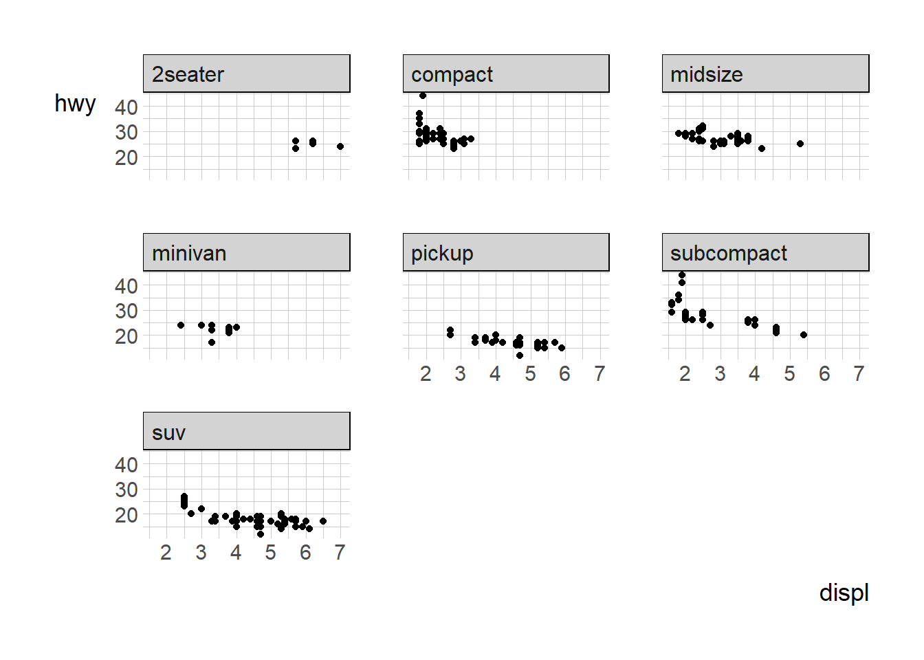
ggplot2 provides an intuitive way to build visualizations layer by layer. Mastering these basics sets a strong foundation for more advanced customizations and analyses.